Steal This Idea: The good and different chart
A tool for evaluating customer feedback on brand concepts
What prevents most companies from zagging—creating new and different offerings—is the cloud of uncertainty that follows innovation. In an effort to remove the cloud, marketers often conduct focus groups, which, while helpful in some situations, are notably unhelpful for encouraging innovation. This is because radical differentiation doesn’t test well in focus groups. When you ask people what they want, they’ll invariably say they want more of the same, only with better features, a lower price, or both. This is not a recipe for radical differentiation, but for me-too products with minimal profit potential.
A better way to judge a new offering is to map customer feedback against a success pattern. When you draw a chart with two axes, one for “good” and one for “different”, you can see how your business concept stacks up against other successful zags. You can also begin to see why most companies are fooled by focus groups.
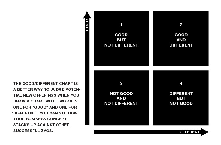
On the chart, the “good” axis can include any attributes that customers typically value: quality workmanship, good aesthetics, low price, high functionality, ease of use, speed, power, style, and so on. These are the qualities on which most offerings compete. The “different” axis is for any attributes that make an offering, well—different. These can include attributes that customers may characterize as surprising, weird, ugly, fresh, crazy, offbeat, novel, and so on.
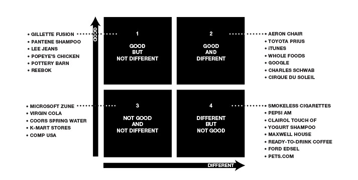
As with other charts of this type, the best place to be is in the upper right corner—in this case, where good and different combine to create a successful zag. Classic examples are the Aeron chair, Citibank, Toyota Prius, Charles Schwab, and Cirque du Soleil. However, successful zags usually test poorly with consumers before they’re launched. They fare pretty well on the “good” axis, but then attract so many negative comments on the “different” axis that companies get nervous and reject them.
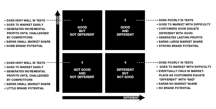
Not surprisingly, where companies find the most encouragement is in the upper left corner. Offerings here test extremely well, and the “good” comments are rarely undermined by negative comments such as “weird”, “ugly”, or “offbeat”. But the reason customers don’t make negative comments about offerings in this corner is that there’s nothing new or different to dislike. So while offerings in the upper left may test extremely well, there’s little chance that they’ll open up profitable new market space.
Offerings in the lower left corner, where “not very good” meets “not very different”, test fairly well with customers, since there’s little to dislike or misunderstand about them. While this can encourage companies to proceed, in the end these offerings fail because there’s either too little demand or too much competition.
Offerings in the lower right corner usually don’t get off the ground at all. They’re perceived from the start to be dogs—and guess what?—they are.
What makes the good/different chart tricky, though, is that some of the potential winners in the upper right corner look a lot like the losers in the bottom right corner. The line is often blurred, and the consequences for making a bad call can be extreme. It may take an experienced innovator to tell the difference—someone who can match the customer research to a previous pattern of success.
HERE ARE FIVE STEPS FOR USING THE GOOD/DIFFERENT CHART:
1. Prototype a wide range of concepts for any brand expression, whether it’s a product, service, experience, or communication.
2. Expose potential customers to your top 2-4 options in a realistic brand environment—not a testing lab.
3. Ask questions that probe what each offering “means” to the customer in relation to competing offerings.
4. Plot the answers on the good/different chart to see which options fit quadrant 2.
5. Repeat as necessary until you find your zag.