Crafting a strategy to inform the new Ernest brand identity and beyond.
How looking inward at culture, history, and clients’ success informed a dynamic new brand.
Setting the stage for authentic connection and growth.
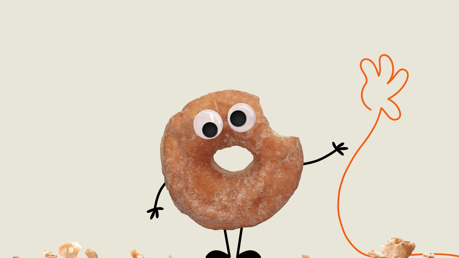
More than just a new look, the new brand goes to the heart of what Ernest is and has been built on since 1946: human connection. With their vibrant new expression, personalized web experience, and authentic interactions that set them apart, Ernest has proven they’re not just boxes, bubble wrap, and the occasional donuts delivery. They’re ready to empower both their clients’ and themselves for continued growth.
Follow along for details on the dynamic and comprehensive internal launch of Ernest’s new brand in Article 3 of a 4-part series about the Ernest brand refresh and launch.
Article 2 in a 4-part series about Ernest’s rebrand
In the packaging industry where products often come before people, Ernest and Liquid Agency knew that human connection was the thing that set the Ernest brand apart. Because anyone can sell a product or service with the latest technology. Those are just table stakes. What makes Ernest special is the relationships they create. So, we looked inward to understand how we could further convey this truth about what the brand stands for.
Finding the “why” in an unexpected place.
After 16 years of growth as a result of Ernest’s first rebrand with Liquid Agency in 2007, Ernest needed an updated brand that focused heavily on human connection. They were investing a great deal of time, effort, and resources into their relationships with clients and understanding their clients’ plans for growth. Plus, their operational goals involved in helping their clients grow, whether or not that involved packaging. This was our “aha” moment: the new brand would journey beyond packaging to be about fostering relationships and client success.

This wasn’t a new concept. Ernest had been with some of their clients for over 20 years and prioritized mutual success through ups and downs. For example, when many of their clients were struggling with supply chain issues as a result of the pandemic, Ernest doubled down on their Ernest Managed Inventory (EMI) solution to help their clients weather the storm as efficiently as possible. While many packaging companies shied away from their struggling clients at this time, Ernest increased in-person calls and continued to deliver products as an essential business of the supply chain. Ernest has always put relationships first, from the front desk to the back of the warehouse. Now, it was time to show that through the new brand.
The strategy.
The Ernest brand platform came from research and many Swarms, which is Liquid’s proprietary method to co-create with our clients to arrive at breakthrough solutions. This resulted in a shift to highlight human connection as our Brand Position. The tagline, “Moving Packaging Forward,” was a key artifact from the 2007 rebrand that survived informed by our Brand Aspiration to always challenge conventions. And an updated Brand Promise, Ideal Brand Experience and Expression Attributes informed all the creative work that followed.

Looking inward for a fresh expression.
Ernest has always been fun, thoughtful and a little avant-garde. They have never wanted to be seen as just a B-to-B industrial company. Even though they sell a lot of commodities it’s the people relationships that stand out and showing up more like a consumer brand is part of the strategy. Knowing this we turned up the volume across the entire brand language through unique patterns, collages, and chevrons.
Name
Once we started going down the path of relationships, we got curious about the company name: Ernest Packaging Solutions. We had helped Ernest Paper Company switch to Ernest Packaging Solutions in 2007.
We wanted to maintain the Ernest name to honor the legacy of a co-founder, Ernest Wilson and we didn’t want to change the legal corporate name. Liquid recommended to simplify the brand name to just Ernest, a name that clients would easily notice and recognize in the marketplace and align with the new logo.

Logo
The updated logo represents movement, direction and progress. The chevron element of the logo is derived from the former logo where chevrons were combined to represent a box unfolding.

Over the past decade plus we created a number of logos used for certain programs such as legacy blog, intranet, and their training program and wanted to update them to align with the new system. We also created logos for new Ernest’s program such as our video on demand program Ernest + and our customer testimonial series Blazing Tales.


Colors
To maintain brand equity and honor Ernest’s heritage, we kept orange and yellow in the primary palette. Orange is a distinguishable color among brands and something Ernest can continue to own.
The secondary palette introduces new and energetic blues, greens, pinks, and purples to convey the unique Ernest quirk, while the extension palette also includes more neutrals to enable content creation for a broad range of platforms and touchpoints.

The brand identity system also includes typography, iconography, photographic style, voice and tone, signatures, physical elements, and more that align to the Ernest brand story and the core of who they are, where they come from, and how they’re moving forward.
Embracing the “Ernest quirk” through graphic elements.
Ernest has always been fun, thoughtful and a little avant-garde. “Where’s the Ernest quirk?” is a question that’s asked often at Ernest. The quirk aligns with a strategy to facilitate human connection— it starts conversations and builds community. By using humor intentionally and authentically, it shows that Ernest is not a faceless conglomerate of products and equipment. This quirk is an asset, so we amplified it across the brand expression and empowered Ernest teams to use the new creations with confidence.
Motifs
We created a set of proprietary patterns and color pairings that help visually unify the design system. These patterns can be scaled and rotated for variety, and can be used to build collages or other more complex visual elements.

Collages
Collages blend photos and images with brand colors and patterns to convey the signature Ernest quirk. Sixteen solution and service collages represent the distinct types of work that Ernest does for their clients. Each Ernest division has their own collage with dynamic regional imagery to represent the local markets they serve. Additional collages represent company heritage, recruiting and an experience like Ernest +—and the Ernest Marcom team have the tools to build out more as inspiration strikes.


Chevrons
To illustrate the breadth of solutions Ernest provides across industries, we created a library of branded 3D chevrons. Derived from the logo, they serve as a whimsical way to show that Ernest can move any business forward.


A national corporate website with hyper local division sites to serve local markets.

Ernest has regionally tailored versions of their website landing page—one for each of their divisions and one national homepage. How do we make sure that someone in the Boise region gets the Boise website, complete with potatoes and all? The website contains geolocation features that track visitors’ general location in order to serve them the relevant local website, branded elements, and content. If someone is in an area without an office, they’ll get the national website. Within the local sites, we make sure that local customer stories and employee profiles come up first aligned with up to date local Google listings. All content including local photography and events is contributed by the regional divisions themselves for top-notch authenticity.
This localization is critical to business because, unlike many, Ernest is not an e-commerce provider. They only deliver directly to warehouses within 100 miles of their division locations. The greater they index locally, the more they’ll show up in the relevant Google rankings organically.
The Ernest website is also optimized for their clients and community to engage with their most popular content: video. On Ernest’s new video platform, Ernest+, users can enjoy an extensive library of over 75 videos with a seamless, user-friendly experience. Like Netflix or Disney+, it’s easy to sort by video type to find exactly what you’re looking for and it’s free for life! From client stories, to heritage videos, to our Cardboard Chaos or E-Team series, it’s all here. And unlike YouTube, Ernest+ offers a controlled, ad-free environment.