Cushman & Wakefield gets a more modern brand identity
DTZ, the largest commercial real estate in China recently merged with Cushman & Wakefield, a global commercial real estate company with US headquarters. The two companies combined represent the second largest real estate services company in the world. The company is operating under the iconic Cushman & Wakefield brand—and we were hired to update the brand identity. Here’s a glimpse at what we did.
An evolutionary approach.
![]()
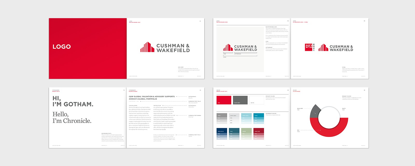
Following its merger with DTZ, Liquid Agency was asked to design a new brand identity for Cushman & Wakefield, taking into account the rich legacies of both organizations, while creating a more contemporary platform to propel the new brand forward.
In the process of developing the new identity Liquid explored a variety of directions, some of which introduced a completely new visual language for the brand identity. However, after evaluating the equity and awareness of the existing Cushman & Wakefield brand identity it became apparent that it would be better to make changes that were evolutionary as opposed to revolutionary.


Simplification suggests sophistication.
The final solution extracted and simplified the essential elements of the two logos – a globe, buildings, and a square. The globe shape was eliminated and the icon instead focused on the building shape. Liquid also evolved the typography by making it lighter and more elegant. Additionally, Liquid updated the color scheme by using the DTZ red – which is brighter than the original Cushman & Wakefield red. This was also helpful considering that, for legal reasons, the new logo would need to be paired with the DTZ logo in a few regions (Europe and China). Lastly, Liquid changed the color of the typography from a dark blue to a light gray – which is more neutral and more sophisticated.
A collaborative approach leads to great results.
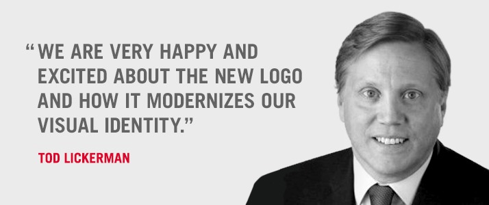
The entire project was completed in one month—a timeline that would not have been possible to meet unless we engaged the client in a very collaborative manner. We worked side by side with the management teams at DTZ and Cushman & Wakefield, evaluating options, making changes and decisions together. The final logo is the result of this collaboration and represents a fresh, new and more contemporary style for Cushman & Wakefield—reflecting the spirit of the new global company. According to Tod Lickerman, Global President of Cushman & Wakefield, “The new logo is being met with solid support and positive comments from our global leadership and our clients. We are very happy and excited about the new logo and how it modernizes our visual identity. It was a pleasure working with you and your team on the project”.
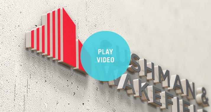
Watch the unveiling of the new logo: