Aruba Networks built a global reputation by providing smart, powerful mobile networks with a customer-centered approach, but felt their brand no longer reflected their business proposition. They hired Liquid Agency to reposition the brand, develop a new messaging strategy and refresh its brand identity. Soon after, HP acquired Aruba in a deal valued at approximately $3 billion.
Aruba Networks built a global reputation providing smart, powerful mobile networks with a customer-centered approach. But by the fall of 2013, the company’s brand no longer fully reflected its business proposition. More than hardware-based networks, Aruba offers integrated, software-enabled solutions to optimize mobile network capability. For end users—from doctors accessing electronic health records for patients in distress, to football fans using smartphones to find the shortest line for hot dogs—that meant more seamless mobile experiences with optimal efficiency, security, and control. To articulate this story internally and share it with the world, Aruba turned to Liquid to guide a comprehensive company rebrand and new messaging strategy.
Our process started with getting to know Aruba—the business as well as the people we were working with. We heard from key company stakeholders, and interviewed customers and industry analysts to understand the company’s core strengths and the unique position it could own in the market. What we found is that Aruba helps people access and share information—which, in today’s mobile, information-based economy and culture, means giving them power to do just about anything. Even more specifically, Aruba excels at providing integrated, customized technology that lets users get the information they need easily and seamlessly, on virtually any platform or device. And it gives companies opportunities to save time and money on a primary and ever-expanding cost center, IT.
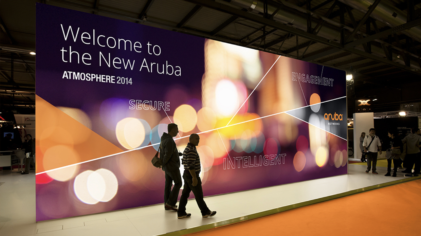
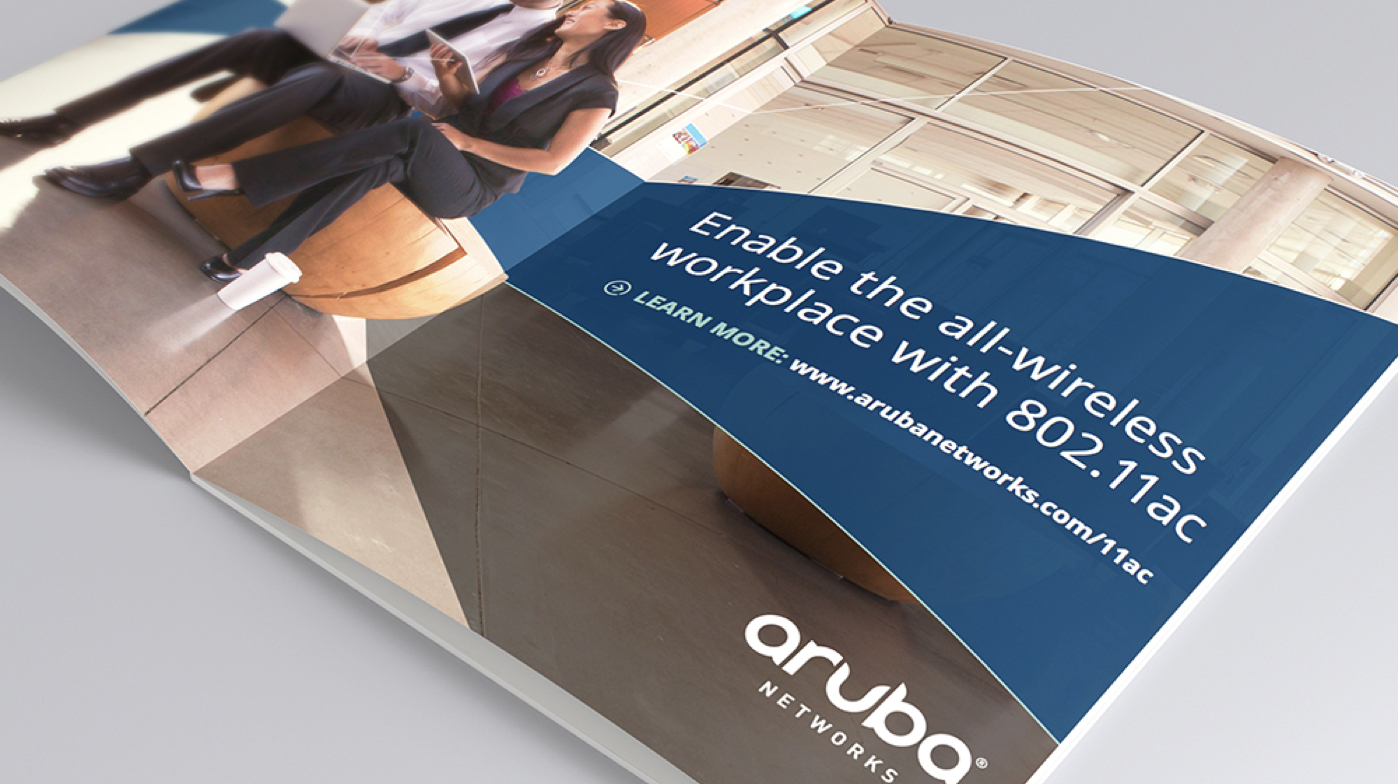
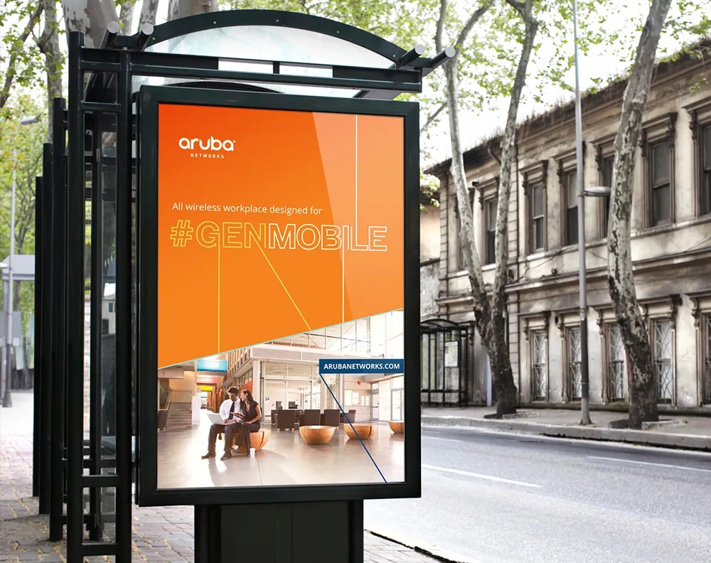
One of the most appealing attributes of Aruba’s technology is that, to the end user, its presence is imperceptible. Martha Bowman, Director of Brand Strategy at Liquid, defined Aruba’s brand position as “the ‘hidden ingredient’ in a better mobile network experience.” So, our challenge lay in how to express a brand that stands for something that is, in its essence, at once boundless and ineffable. Ultimately we landed on the the idea of intelligent mobility and active human possibility, as represented in the tagline: “People Move. Networks Must Follow.” At the center of this vast web of mobile connections—or more accurately, at infinite points of convergence—is Aruba. Positioning the brand as “the nexus of intelligent mobility,” we created awareness both of Aruba’s status as a thought leader in the enterprise mobility industry, and to the company’s history as an early pioneer in the mobile network space.
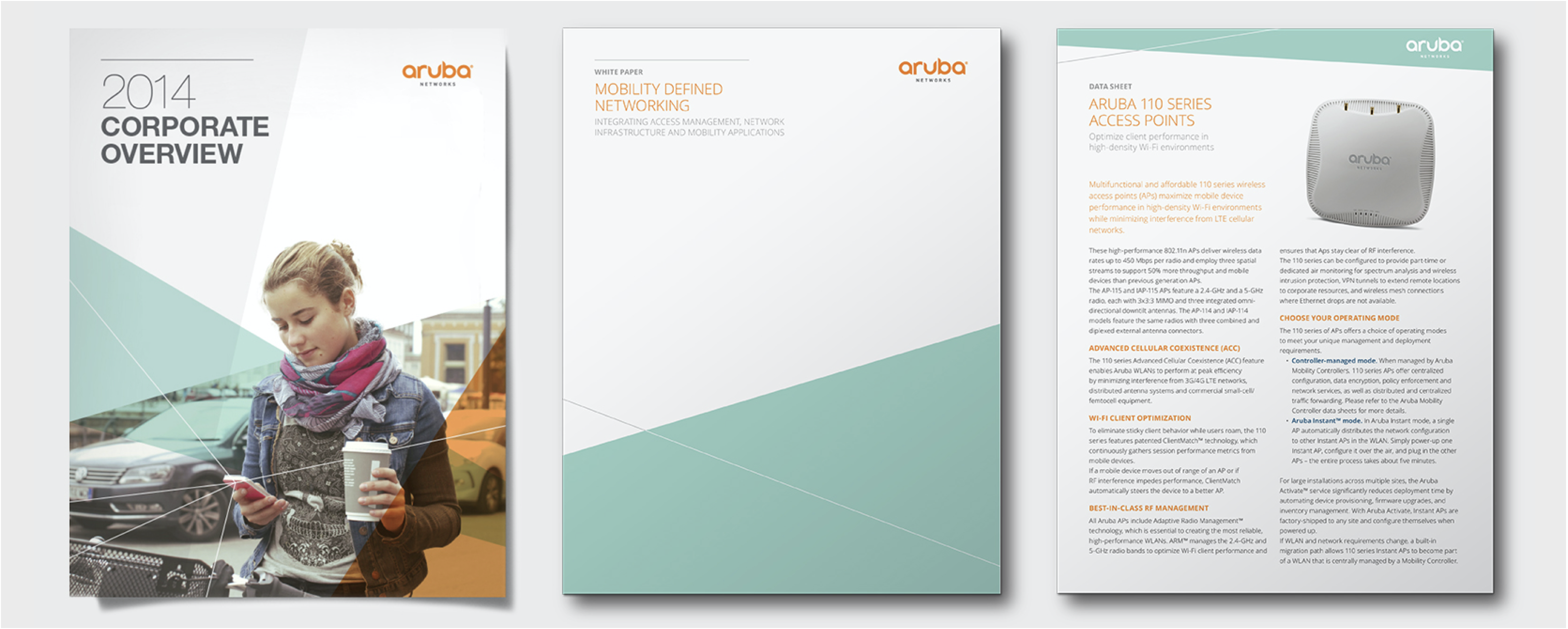
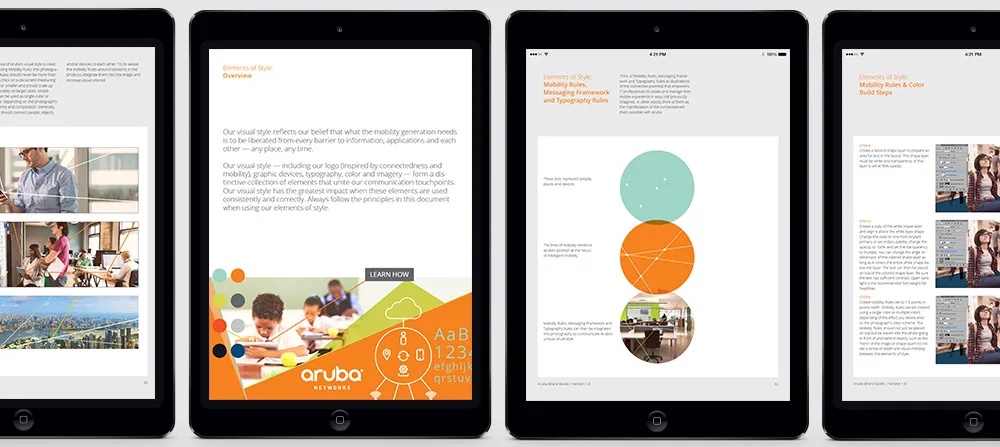
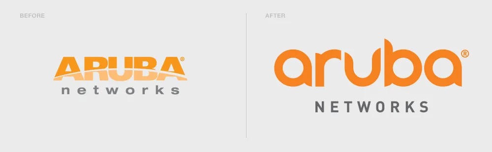
In keeping with our Silicon Valley Thinking philosophy, Liquid developed initial concepts for visual identity and messaging in tandem with developing the brand platform—an approach that helped us meet an aggressive six-month timeline, driven by the launch of Aruba’s Mobile Generation of products at the Atmosphere conference in March 2014. Building on the themes of interconnectedness and mobility, we created a new logotype for Aruba in which the five letters in the brand name suggest a series of links in a chain. The flowing lowercase letter-forms evoke Aruba’s newly defined brand expression attributes: liberating, intelligent, and empathetic. Another essential element of Aruba’s new visual style is a graphic element, nicknamed “Mobility Rules,” which consists of a simple, variable pattern of converging lines. Rendered in colors from Aruba’s new palette (orange, gray, and seven secondary hues), the Mobility Rules are used to connect images to imaginary points outside the frame, expressing a sense of limitless movement and connectivity.
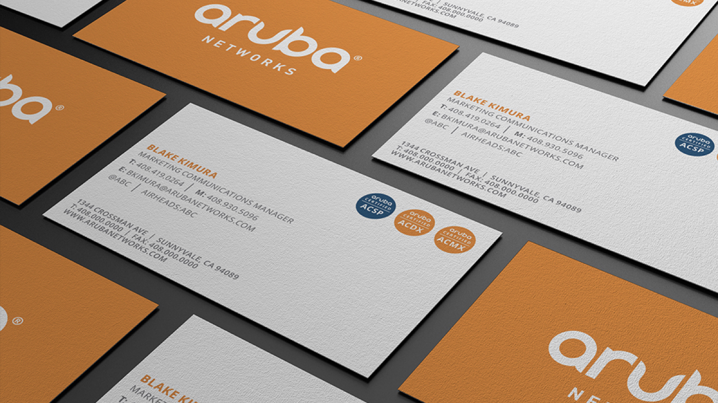
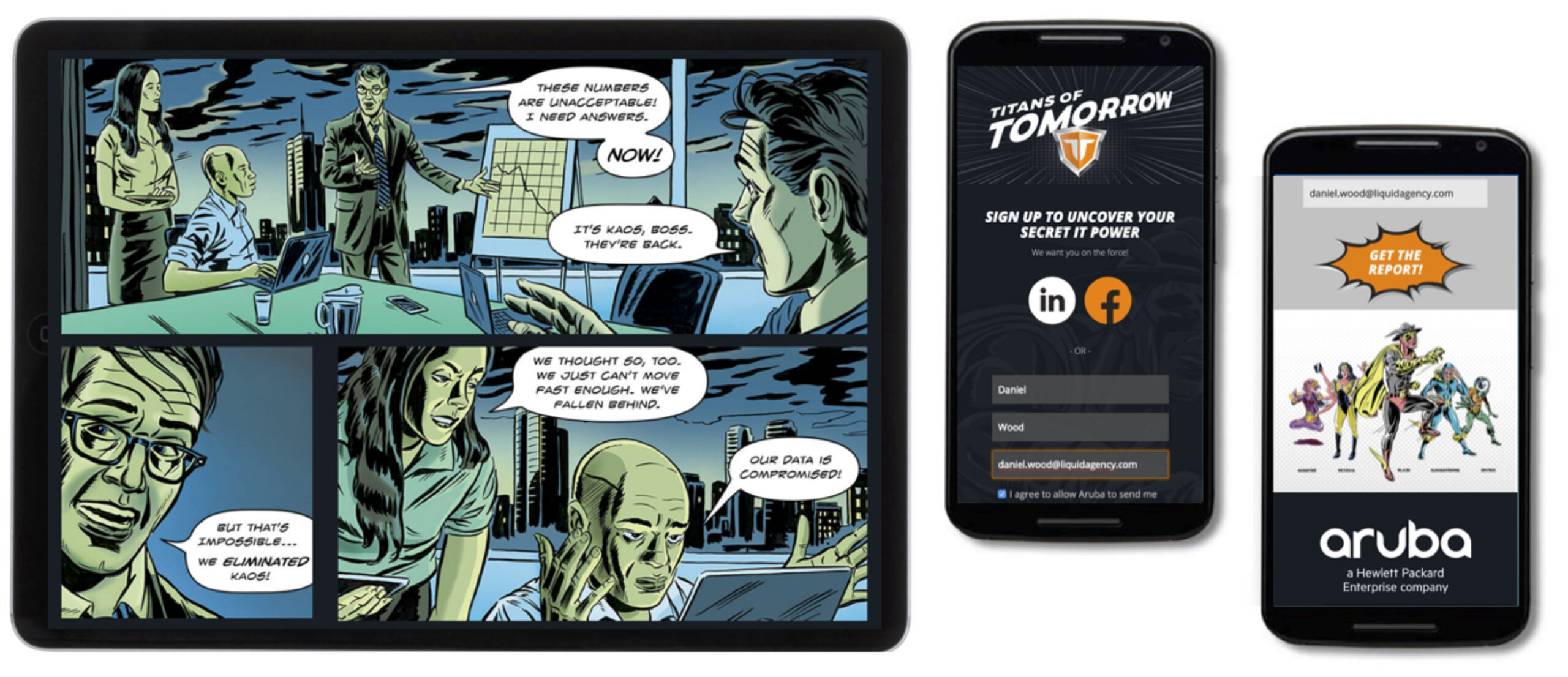
We also developed a robust set of tools and guidelines to enable Aruba’s marketing teams to implement the new brand identity in any context. A 70-page Aruba Brand Guide provides specifications for using color, type, graphics, and photography, and is accompanied with templates for business cards, letterhead, and print collateral. Our work even extended to solving some some nitty-gritty implementation challenges. For instance, we devised custom digital photo filters that enable Aruba’s creative staff to give stock photographs a look consistent with the company’s new visual identity. Foreshadowing a complete website redesign we’ll carry out later this year, we refreshed the look of key pages of Aruba’s existing website, and created a flexible content elements (FCE) template for Aruba’s internal web designer to use in refreshing the rest of the site. We also created a series of “Arubicons,” graphic icons representing Aruba’s core services, formatted as characters in a web font to enable easier input and quicker page load time, as compared to standard PNGs or GIFs.